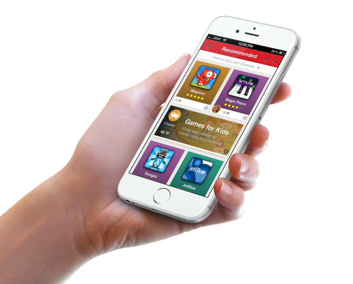
My role at Drync included analyzing and revamping the entire user experience across the board. We started with all of the central user-flows like the scan flow and purchase flows. Once those flows were optimized, we took a step back and redesigned the entire application with a focus on telling a more coherent and consistent story.
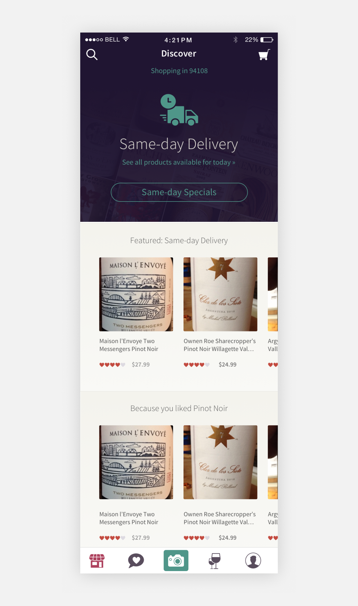
Above: A view of the redesigned app with the highly successful “Same day delivery” feature.
With retail partnerships in both Boston and San Francisco, we were able to offer wines that were available for delivery within minutes of ordering. This feature required multiple app enhancements including optimized onboarding to ensure users opted for allowing location services.

Above: A test launch of a wine subscription service. The idea was to offer users wine selected by professional sommeliers, based on the ratings and reviews of the wines they scanned in the Drync app.
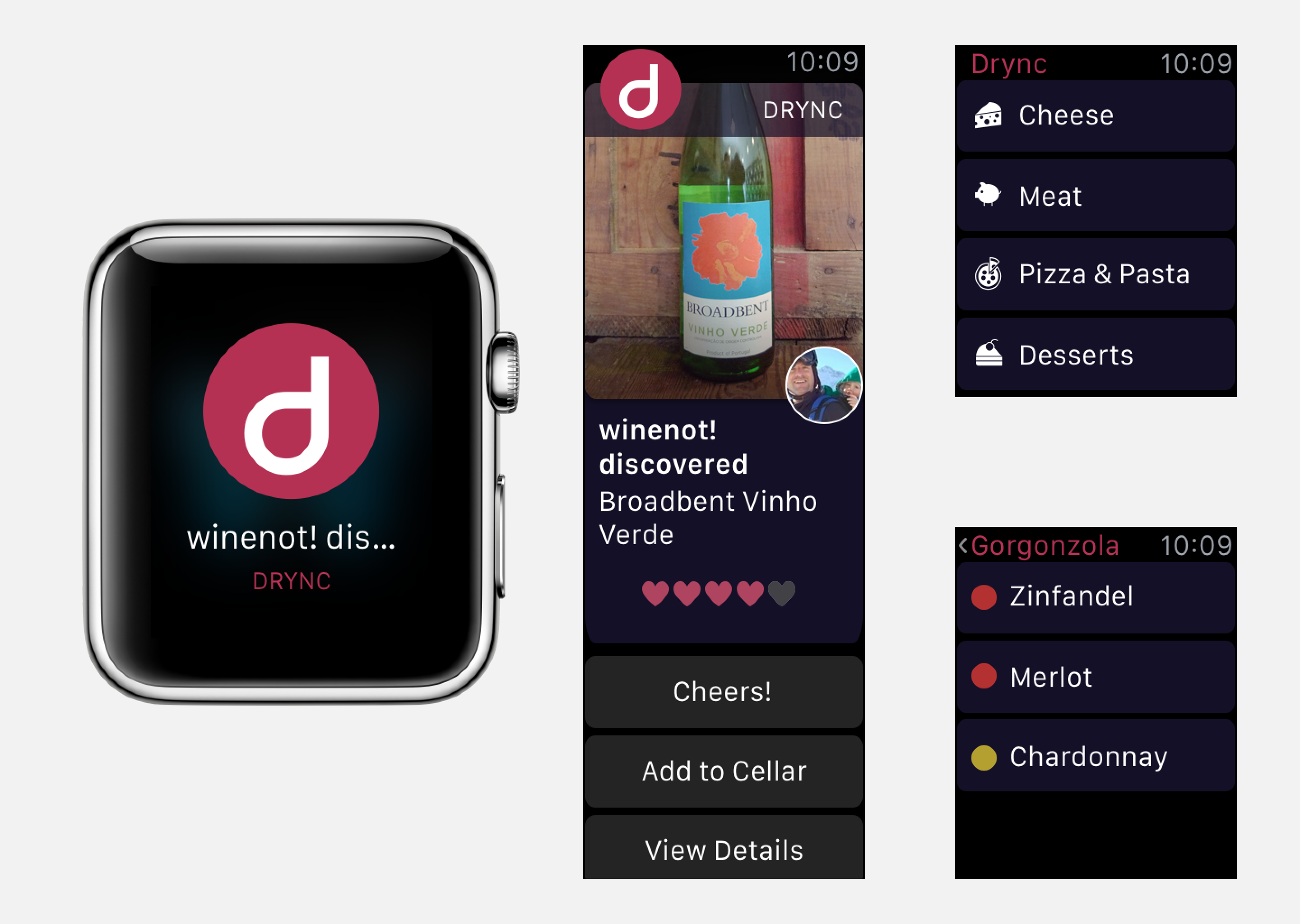
Above: When the Apple Watch was announced we immediately looked to create a companion app for Drync. The Apple Watch was and is perfect for app notifications. However, we wanted the app to have some use beyond that. This iteration looked at offering users a way to have all of our wine pairing information at the tip of their fingers without having to take their phone out of their pockets.